Twelve Days Cocktails
Mobile app case study for the Twelve Days of Cocktails concept
Role
UX/UI designer
Project
New mobile app
Duration
~6 months
Project TL;DR
The app was designed to address the challenge faced by many users who want a space to create, share, and discover cocktail recipes but feel overwhelmed by the vast number of options available.
Research revealed that users, whether novices or seasoned bartenders, often find cocktail creation intimidating and struggle to explore new recipes. The primary product goals were to boost user confidence in cocktail making and ensure simplicity and clarity across all age groups. The design features a vibrant, graphic visual system with distinct colors for each spirit and encourages user-generated content to foster community.
User testing highlighted intuitive navigation and valuable features, though improvements were needed for consistency and clarity in social interactions. The final prototype included a Discover Page with a comprehensive recipe catalog and a Profile Page showcasing user activity and social connections.
Ongoing improvements aim to balance the needs of both experienced and new users, with further testing planned to enhance the app's functionality.
The Problem
Some people want a space to create and share their recipes. While others want to learn and expand their knowledge of creating new and exciting cocktails. Most people feel overwhelmed with the amount of cocktails and liquor choices on the market whether they are seasoned veterans or rookies when it comes to bartending.
User pain points
Overwhelmed by amount of liquor choices
So many cocktails that it is confusing to find one suited to your taste
Research
As someone who enjoys creating and making cocktails, I realized that not everyone views creating drinks as something easy to do. Many people I spoke with know how to make only a few tried-and-true drinks and have a difficult time finding cocktails to try. It is often that they are intimidated by the numerous cocktails and liquor choices on the market.
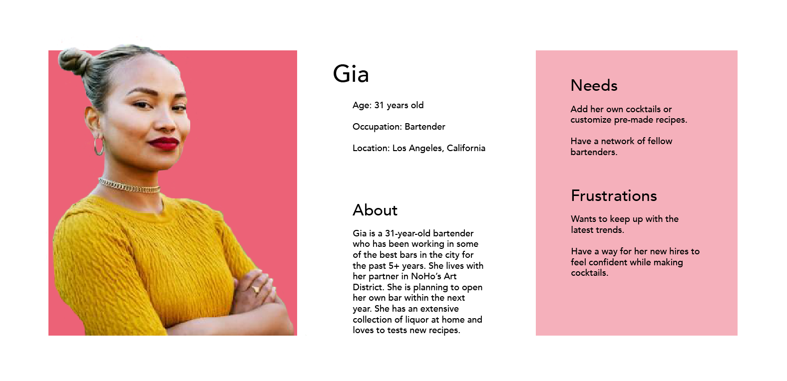
After performing a deep dive into how people view cocktails and create their drinks or find new recipes to try. I determined product objectives and user needs, developing a Persona and Journey Map.
Project Goals
Improve user confidence
With the app as a resource, hopefully, users can feel more confident while creating and exploring the art of cocktail making.
Simplicity + Clarity
Since the app will be used by a variety of people, I wanted the design to be easy to understand whether you’re 21 or 91, and to have consistency for users to familiarize themselves with the application's features.
Ideation
Taking my research, intended features, and key product goals, I created some basic sketches and wireframes to figure out the design layout and decisions around content placement.
Visual system
When choosing the design system for this product, I knew I wanted to use bright and energetic colors. The visuals are graphic in their approach since I wanted the users to upload photographs of their drinks to create more of an online community feel.
Each spirit/alcohol has its color that evokes how one may feel when drinking that type of spirit.
User testing
During the prototyping process, I reached out to several people of varying ages who were willing to lend a hand with testing as I made changes.
What was working
Users were able to navigate the product quickly and appreciated the value of its features. Many praised the application’s intuitive design, noting how easily they could explore its functionalities.
What needs improvement
In the initial prototyping phases, some design elements lacked consistency, and users noted this issue. They expressed confusion about the sharing, liking, and disliking processes, seeking greater clarity. I addressed these concerns in subsequent iterations.
Prototype
Using prototyping to collect unmoderated user feedback helped identify frustrations and enabled rapid iterations, guiding the development toward the final designs.
Check it out!
Outcome
After user testing, I pushed the working prototype in Adobe XD further, keeping the same aesthetics to keep a simple and clear interface. I made small tweaks in the content and added a few elements just to make things more articulate, especially with a focus on the social aspects.
Discover
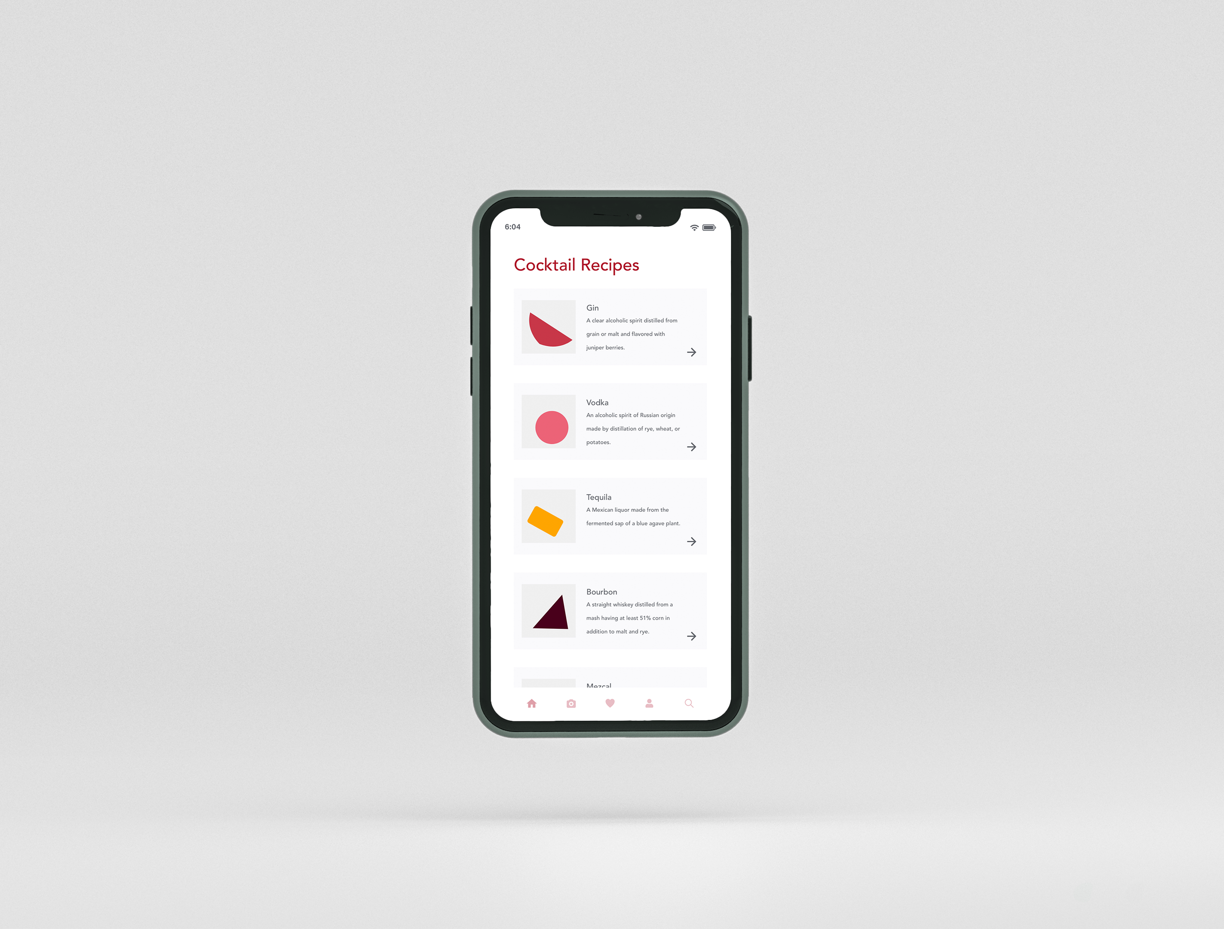
The Discover page features an extensive catalog of recipes organized by type of alcohol or spirit. This categorization simplifies liquor choices, helping users more easily explore and find new cocktail options.
Profile
The profile feature adds a social dimension to the app, allowing users to connect with friends, share recipes, and receive personalized recommendations based on their cocktail preferences. Users can view their followers, those they follow, and their likes. Additionally, the social feed displays recent activity and suggests recipes and users that may interest them.
Reflection
I enjoyed working on this project and plan to continue refining it. Initially, I faced challenges balancing the needs of both experienced and novice bartenders, and I aim to address this further. Additionally, expanding user testing will be crucial for identifying additional features and improvements to enhance the app's functionality and user experience.
Interested in exploring the cocktails?
Over the years, this project has expanded into a dedicated website that features a comprehensive collection of cocktails. I’ve created this site to showcase all the cocktail recipes and graphics from the Twelve Days of Cocktails. Explore the site to discover and try out some exciting drinks!


